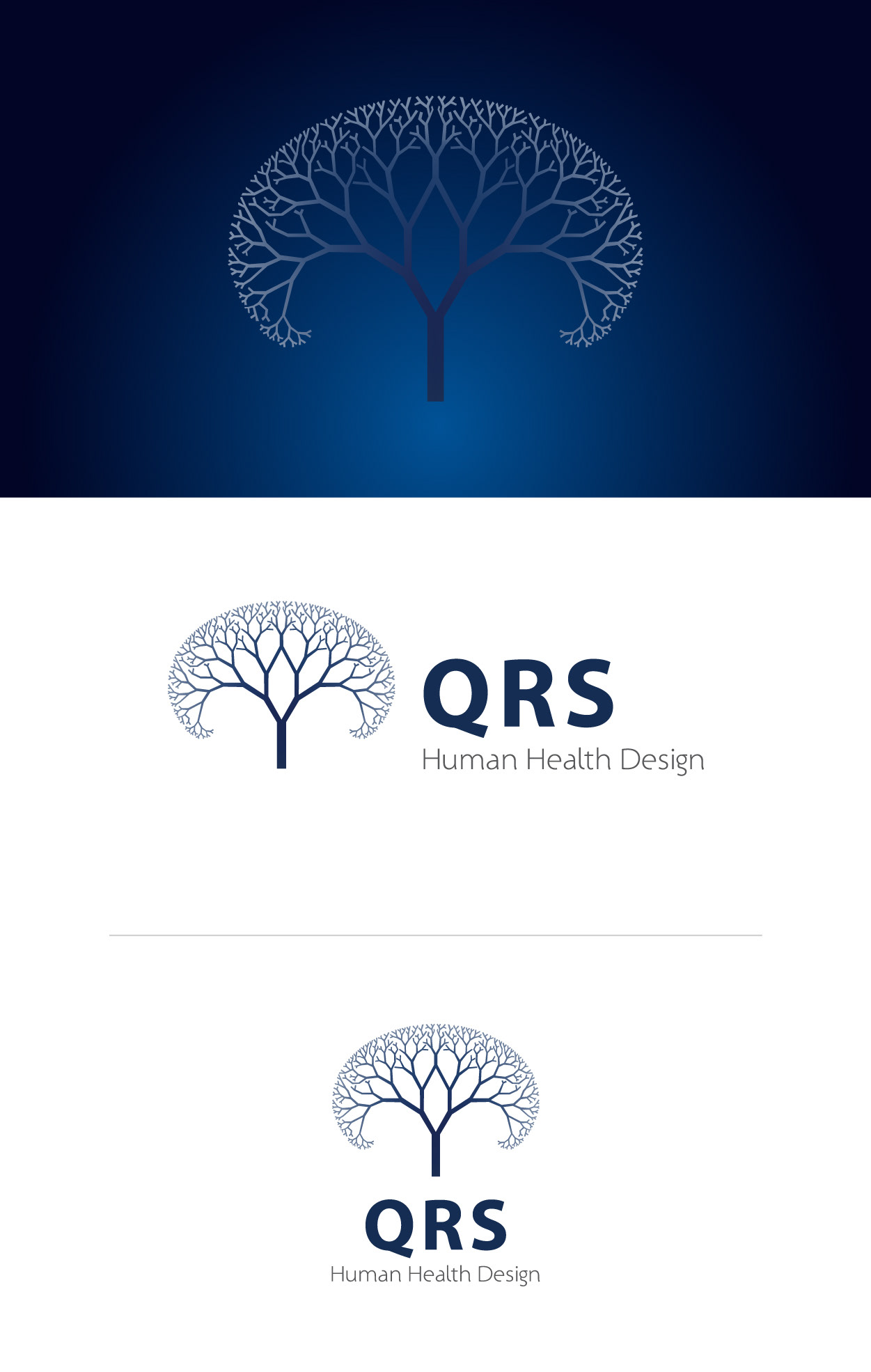
QRS International, a company specializing in Quantum medicine and therapy, required a brand identity that would capture their commitment to science and nature.
To achieve this, I designed a fractal tree symbol that reflects the interconnectivity and natural patterns found in Quantum mechanics. The logo is the centerpiece of the brand identity and features a fractal tree with intricate branches, representing growth and expansion, and the interdependence between different aspects of Quantum medicine.
The logo is primarily blue, with shades of grey to add depth and sophistication. This color palette was chosen to represent the calming and healing nature of Quantum medicine and to evoke a sense of trust and professionalism.
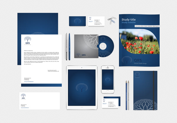
To complete the branding, I also created a full suite of supporting elements, including business cards, letterheads, envelopes, and more, all of which were designed to be consistent with the brand identity and enhance its impact. The resulting brand identity is a powerful representation of QRS International's mission to improve the health and well-being of their clients through cutting-edge Quantum medicine and therapy.